Designing an interesting website is not an easy task. It takes expertise and that is why most companies opt for UI design services to get the job done. The basic criteria for any web design are its user-friendliness so you should how to use css. It should have easy navigation and accessibility. That brings us to the layout of a website.
The multi-column layout is often overshadowed with other exciting CSS layouts like Flexbox and Grid layouts. The multi-column CSS layout is simpler and used more often due to its effectiveness. It is also called multicol or CSS Columns. This article will discuss how to use it and what it is best suited for.
Multicol Defined
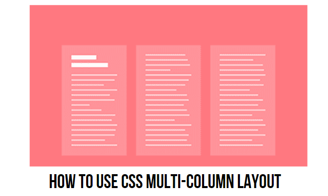
The idea of using multicol is taking chunks of content and distributing them into multiple columns. Like a layout in a newspaper. This is achievable by using two CSS properties:
- Column-count: this will specify the number of columns that the content will be distributed into.
- Column-width: this will specify the ideal width. However, the browser will figure out how many columns will fit in that width without disturbing the design layout.
The elements present inside the content do not affect the layout when it converts into a multicol container. Everything will be in a normal flow but, will be broken into equal columns. Due to this feature, multicol is different and unique from other layout methods that we see on our browsers today.
Take Flexbox and Grid layout for example, where the child elements of the containers participate in how they will be displayed. In both Flexbox and Grid layouts, the elements do not flow freely as compared to column layouts.
Columns Styling
The column boxes created using its properties are not targetable. JavaScript cannot address them even while trying to style each individual box. The background color, fancy margins or padding cannot be added or changed. Styling the multicol layout is a feature not available for CSS designers right now. However, with constant changes and improvements in the digital industry, this option will be available soon.
Meanwhile, since the styling of columns cannot be addressed, each column will look the same and be the same size. However, designers are able to add a rule between each column by using the column-rule property. This rule property works like a border that allows designers to make at least a few changes. The space between each column can also be changed and controlled as per unique designs.
These are the basic functions of multicol. Content can be broken down into chunks and displayed over few columns. The content continues to fill the columns in the inline direction. The space between each column can be edited using the same rule as border value.
No matter how simple it is, there are a few other things that need consideration that could otherwise lead to potential issues.
Spanning Columns
A great website design consists of content being displayed in an interesting way that keeps the viewers hooked till the end. Designers sometimes prefer to break content into columns and then displaying one element to span across a line in the box. This helps in highlighting important parts of the content. In order to achieve a span in columns, the column-span property can be used.
When a span is inserted into the column box, it pushes the content to break into a set of boxes above the span. Ultimately, a new set of column boxes starts after the span. This ensures that the content does not break or jumps across the spanned element.
Designers can play around with span elements and see how the multicol works best. There are several options available to CSS designers today which gives them an option to mix and match. Experimenting with designs can lead to a better job done.
Controlling Content Breaks
Content breaks are important to control how the final layout looks. No designer wants a piece of content with its heading as the last line of a column box and the rest of the content as the first line of the next column. This is a bad design! Similarly, for content that includes images with a caption, it is best to have the entire unit in one column.
In order to achieve a perfect layout, the breaks need to be controlled. Luckily, CSS has a property that allows designers to control where the content breaks and how it is finally displayed. Splitting the content into columns is called fragmentation. The same process goes through while breaking content for different pages. This brings multicol as close to Pages Media as any other layout method on the web could. CSS2.1 has controlled content breaks using the page-break property. There are three options including:
- Page-break-before
- Page-break-after
- Page-break-inside
Recently, the CSS fragmentation specifications have set properties for fragmentation. These properties define fragmentation by designing any fragmented context. These specifications include many details required for Pages Media. Furthermore, details about multicol and stalled Regions are also included.
When talking about Regions, it is also a continuous piece of content that allows properties generic. These generic properties can be used in the future in any fragmented context. These are similar to the alignment properties from Flexbox where Box Alignment specifications are used. The Grid and Flexbox layout include:
- Break-before
- Break-after
- Break-inside.
On the downside, these properties are not supported by multicol which is quite patchy. Even on occasions where it can use, it should be done so with care since making so many requests can backfire. Trying to control content breaks is a tough property to master. It is a good idea to control only the important cases since the browser cannot really break anywhere.
The Problem of Columns
A multi-column layout on the website has its fair share of problems that designers need to deal with every single time. The main reason why there are not many multi-column layouts on websites is that the reader experience is not a good one. Reading content in the column layout means that the reader has to scroll up and down again and again! This can get frustrating and lead to a higher bounce rate.
Imagine you visit a website that has great content which keeps you hooked from the start to finish. However, when you open the website on your device, the content is shown in the column layout that is spread across the screen. The reader has to read one column and scroll down to finish reading the content of one block. Then scrolls back up to read the content on the next column and scrolls down again to finish reading. This continuous up and down of scrolling causes a negative reading experience.
The same goes for writing modes and a website should always be user friendly. While trying to fix this scrolling problem, designers often try and fix the height of each container by using a viewport of unit vh. However, since the content overflow will still be in the inline direction, there will be a horizontal scrollbar instead. None of the two options is ideal. Using multicol on the website needs consideration and the amount of content that will flow in the columns also needs consideration.
Block Overflow Columns
To address the scrolling issues for a good readership experience, there is a method that enables overflow columns using a specification. Layouts that end up causing horizontal scrollbar can instead be created in the block direction.
Designers can go for another strategy where the height of the multicol container can be set and once one column is filled, a new set starts below. Similar to what spanning does, there will be limited space for the content. However, this time the content breaks will be divided due to the restriction of the block dimensions. This feature makes multicol a lot more useful for website design.
The Takeaway
While Grid and Flexbox layouts are easy to use and much more website friendly, it does not mean that they can serve the purpose every time. Sometimes, the only answer in CSS is a multi-column layout that increases the user-friendliness of a website.
Although multicol will not be used for every website, it certainly can be the answer to many designing problems. Sometimes, businesses ask for a multicol layout in order to make their website look different and serves the purpose of sending the right brand message across.